Perspective
A logo doesn’t have to explain the brand
Words by
Dani
July 10, 2026
Almost every argument about a logo starts with meaning: what the form stands for, what the story behind it is, why three strokes and not four.
But the people who see the logo most, the brand's own customers, never hear that story. They get a few seconds, a mark, and a feeling. The distance between those two things decides most of what an identity is worth.
Every presentation has the same question
Once the first route goes up on the wall, the question is almost always the same: what does this logo mean?
It is a fair question. For a founder the brand is something personal, and the logo is the most condensed, most tangible thing standing in for it. Wanting it to mean something is entirely natural.
But a presentation spent entirely on meaning spends its time on the one part the brand's own customers will never have explained to them. Nobody stands beside a shopfront sign to point out that the three curves stand for three core values.
Meaning is not the problem. The problem starts when the amount of meaning becomes the measure of quality: the more metaphors, the more stories, the more creative the work is assumed to be. Meanwhile the things that actually decide whether an identity is good, whether it is distinctive, whether it gets recognised, whether it holds together, whether it can be run day to day, are far harder to see and almost never fit into a story.
Strip the designer's name off a route that is nothing but a logotype, put it on the table, and the likeliest reaction is still: “Where's the concept?” That logotype may have been worked through in detail: proportion, spacing, character, optical correction, and how it behaves across the whole system. Little symbolism, a great deal of design.
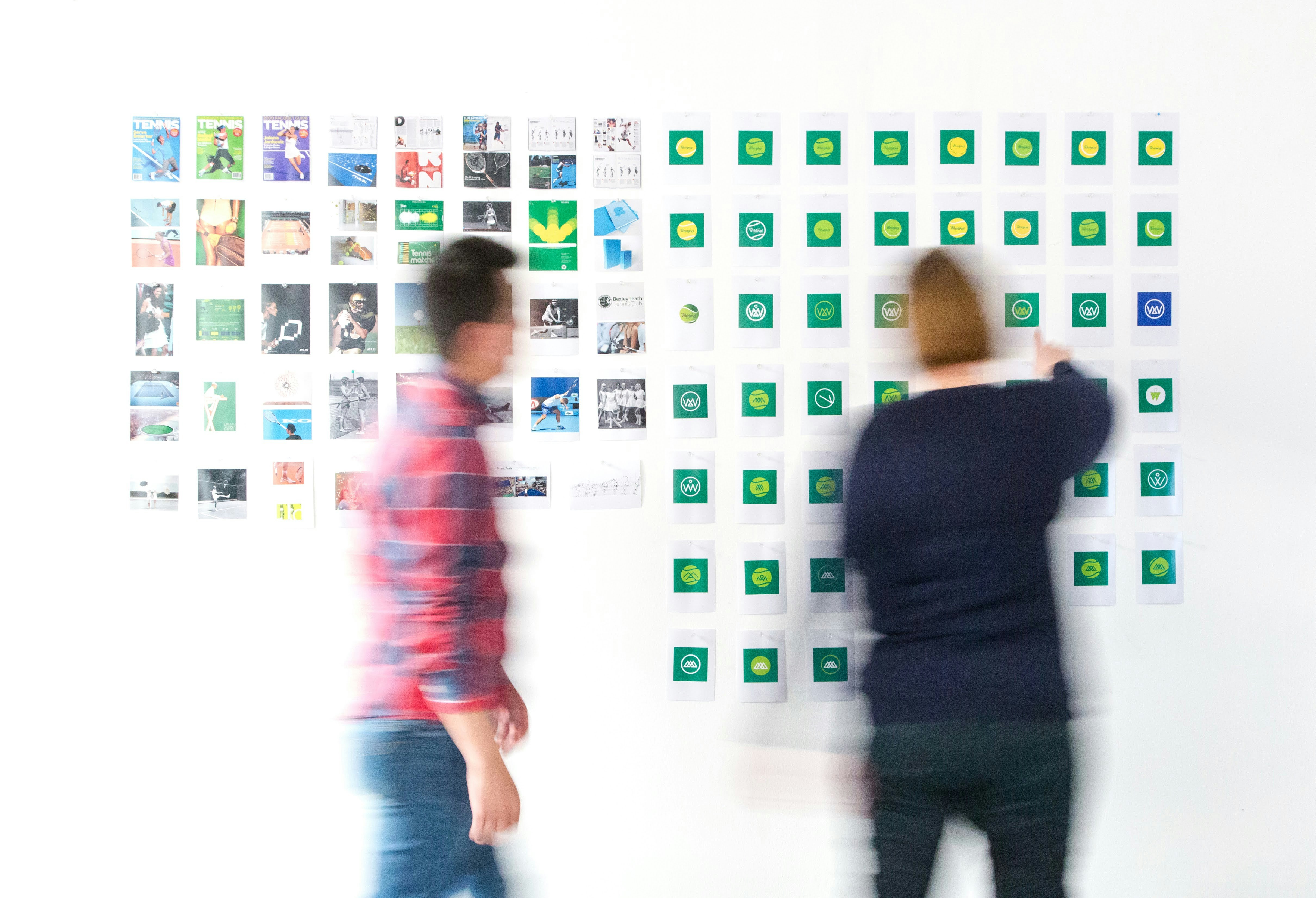
In the room, most of the argument goes to what the route means. The people who will see it most are not in the room.
The first two seconds
The better place to start is where a logo actually does its work.
It shows up as a sign caught in passing, an icon among thirty others on a phone screen, a small stamp on a delivery box, a 16px favicon in a browser tab, a patch on a shirt filmed from across a pitch. In every one of those situations the viewer has about two seconds, no caption, and no interest in decoding anything.
What happens in those two seconds is not analysis. It is a fast run of judgements. Trustworthy or not. Premium or everyday. Warm or cold. Engineered or handmade. Young or long-established. And above all: have I seen this before?
That is association, not interpretation. And association comes out of very physical things: stroke weight, corner radius, the air between letters, contrast, colour. A circle does not need to “stand for protection”. What matters is how soft, how stable or how rigid that geometry makes the brand feel, and whether that feeling is the right one.

On a phone screen, a mark has only a few millimetres and about a second to hold its own among the rest.
A signature, not an introduction
So the basic function of a logo is fairly plain: it lets a brand be recognised. It is closer to a signature than to an introduction.
The brands we treat as defaults make this obvious. Nike uses a tick. Lacoste uses a crocodile. Shell uses a shell. Uniqlo and Zara lean almost entirely on their own names. None of those marks tells you what the business sells, what it believes, or who it wants to become. They still do their job extremely well.
The logos that try hardest to describe the product tend to be the ones that blend in. A bakery draws a loaf, a haulage firm draws a truck, a finance app draws a coin: each is accurate, and each looks like a thousand other brands in the same category. The more precisely a mark describes, the less it belongs to anyone in particular.

A signature explains nothing about the person signing. It only has to be recognised, and not mistaken for another.
Relevance is not description
Saying a logo need not describe its field does not mean it can leave the field behind.
But that context is usually not the subject matter. It is the price tier, the era, and who the brand is speaking to. Two coffee brands make it obvious: an instant coffee sold by the multipack in a supermarket, and a specialty roaster selling a 200g bag at a premium. Neither needs a coffee bean drawn. What separates them is letterform, spacing, the weight of the colour and how loud the whole layout is. Swap one brand's system onto the other and both are wrong, though neither picture misdescribes the product.
This is the difference between representation and association. Representation tells people what the brand does. Association places the brand where it belongs in their heads: expensive or cheap, new or long-established, meant for whom.
So a category has no compulsory look. Within healthcare, one clinic can go clinical, neutral and precise while another goes warm, and both are legitimate. The question is never what the sector looks like, but who the brand wants to be shelved beside.
An architecture studio needs no house. A logistics company needs no truck. A sustainability brand is not obliged to carry a leaf. But their visual language still has to produce associations that fit the category, the positioning and the audience.
Relevance does not require representation.

The category is the same. What separates one position from another is type, spacing, colour and visual weight, not a drawing of the product.
Rationale is not the same as symbolism
Design still needs reasons. But a reason is not a requirement that every detail stand for something.
A decision can be sound because it is more distinctive than the alternatives. Because it survives at 16px. Because it produces the right visual character. Because it matches the positioning. Because it sits beside the typography without fighting it. Because it extends into motion. Because it gives the people who will use it daily a system they can actually run. Or simply because the composition is better. Those are all legitimate design reasons.
There are two kinds of rationale, and they lead to two different conversations.
Symbolic rationale
form → metaphor → story
“The spiral represents the steam rising from the cup, and the bean's journey from farm to drinker.”
Strategic rationale
form → perception → association → positioning
“A fine-serif face with open spacing places the brand in the specialty tier, away from the multipack shelf, and still holds its detail at small sizes on a 200g bag.”
The first line moves a room. The second speaks directly to how the design works, and it has one advantage that matters more: it can be tested. A story can only be believed or disbelieved. An association can be put in front of the right audience, at the right size, next to the brands it will have to stand beside.
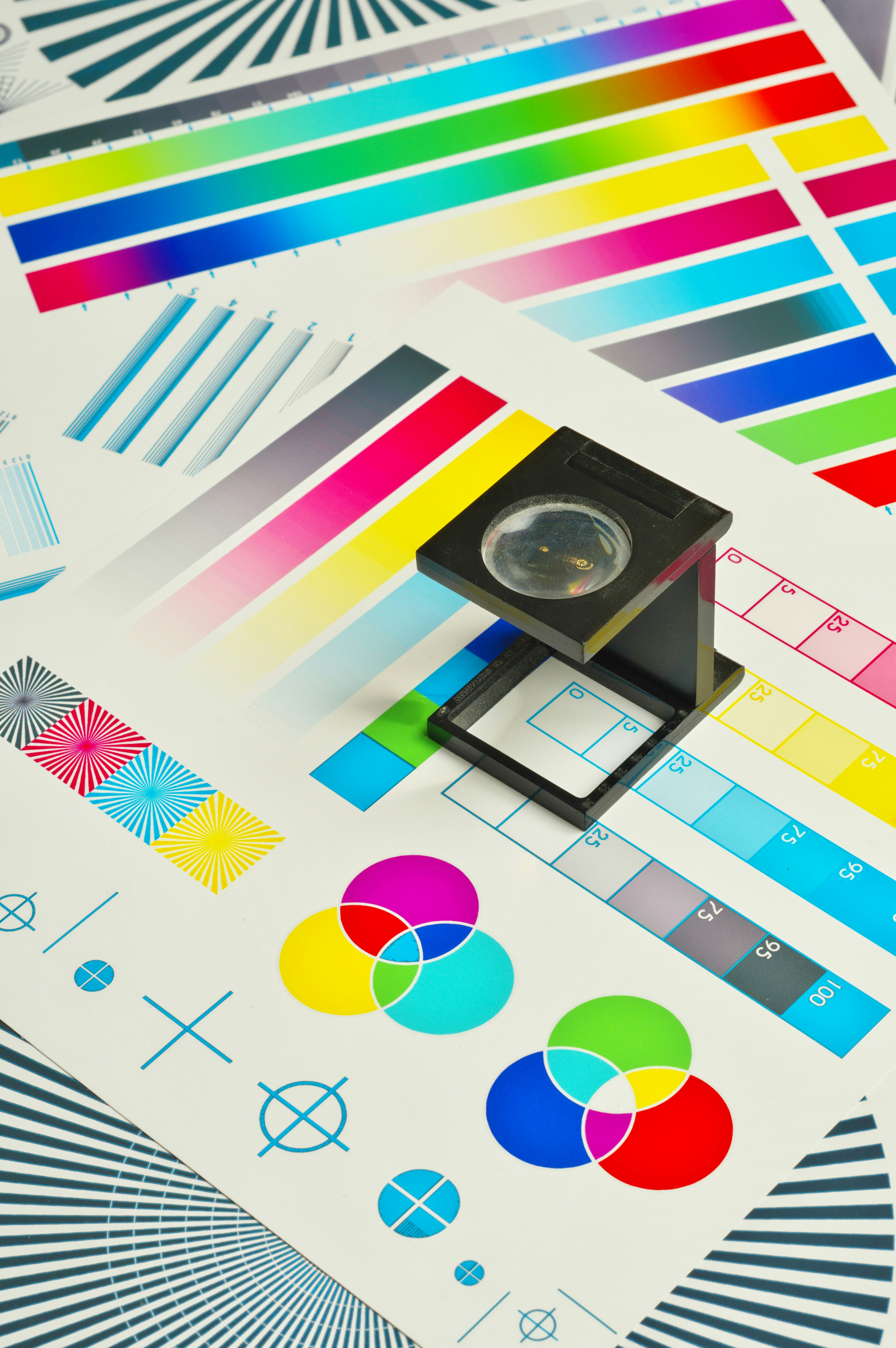
A mark is only finished once it survives reproduction outside the artboard.
A logo does not live alone
What a client is really buying is not a mark. It is the ability to be recognised everywhere the brand appears.
That ability is produced by the whole system: typography, colour, layout, imagery, motion, illustration, material, interface and the way the brand writes. The logo is one part of it, usually the smallest thing on the screen, and almost never the part people look at longest.
Its quality therefore cannot be judged by the symbol alone, but by how it takes part in the system. How it sits next to the typography. Whether it holds its character over a photograph. How many scales it works at. Whether it makes consistency easier or harder. Whether it is flexible enough for touchpoints that did not exist when it was drawn.
A logo that is beautiful on its own can still deliver little if the entire identity has to orbit around it. A very plain logo, by contrast, can become a strong anchor when it performs inside a coherent system.
A logo is not the identity. But it has to belong to it.

A mark becomes recognisable through the system it belongs to: type, colour, layout and repetition across touchpoints.
Meaning arrives later
The logos everyone now finds full of meaning mostly did not carry that meaning on day one.
It accumulated: through the product, through the way the brand speaks, through repeated experience, through advertising, through culture, through thousands of appearances in daily life, until the mark became the container for everything people had been through with the brand. A mark does not generate meaning. It holds a place for meaning, and holds it long enough for the brand to fill it.
The question worth asking in the room, then, is not “what does this logo mean” but “how does this logo make the brand feel”. The second question is harder to answer, and it leads to decisions that still hold up once the presentation is over.
A logo does not have to explain the brand. It has to be distinctive enough to be recognised, appropriate enough to belong to its category and positioning, and coherent enough to become a natural part of the whole identity system.

The meaning of a mark accumulates through use. It is not sitting inside the first drawing.
Resources
Paul Rand, Thoughts on Design, 1947
Wally Olins, On Brand, 2003
Marty Neumeier, The Brand Gap, 2003
Michael Evamy, Logo, 2007
Byron Sharp, How Brands Grow, 2010

